Earlier, I posted on Facebook about some problems with the analysis conducted by Yap and Contreras on 34 time periods sampled from 92,509 possible time periods, representing each and every precinct. In part of that post I discussed Contreras’s interpretation of high R-squared as representing uniform changes, and said that he was half right.
I gave Contreras too much credit here. Someone pointed out that an R-squared very close to 1 doesn’t even mean that the increase will always be close to 46,000, it means that the model explains almost all the variability around the mean of 46,000. A model fit to a tight zigzag can still have an R-squared near 1, which means that the line and the data are still pretty damn close to one another, but doesn’t tell you anything about whether the model systematically overpredicts or underpredicts at any given point. See this article for more information.
In order to directly check the claim of uniformity, here’s what should be done:
STEP 1. Get all 92,509 precincts in the order in which they transmitted.
STEP 2. Create a new set of 92,508 points. Yes, 92,508. Each point will be (difference in vote share after precinct 2 – difference in vote share after precinct 1), (difference in vote share after precinct 3 – difference in vote share after precinct 2), etc. That’s why it’ll be 1 less than 92,509.
STEP 3. Make a plot with the x-axis being 1 to 92,508 and the y-axis being the difference in differences (yeah, that’s confusing, but that’s what it is). Then run a linear regression model.
To reiterate: we are now plotting how much the gap changes every time a new precinct is added, rather than the gap itself.
IF each time a precinct transmits, the vote gaps are increasing uniformly, which would indeed indicate some major bullshit going on and prove Contreras’s point, you should expect the plot in Step 3 to be a flat horizontal line. The R-squared of the regression should be close to exactly 0.5.
IF each time a precinct transmits, the vote gaps are NOT increasing uniformly, which indicates a normal transmission process, you should expect the plot in Step 3 to have no discernible pattern. The R-squared of the regression should be close to 0.
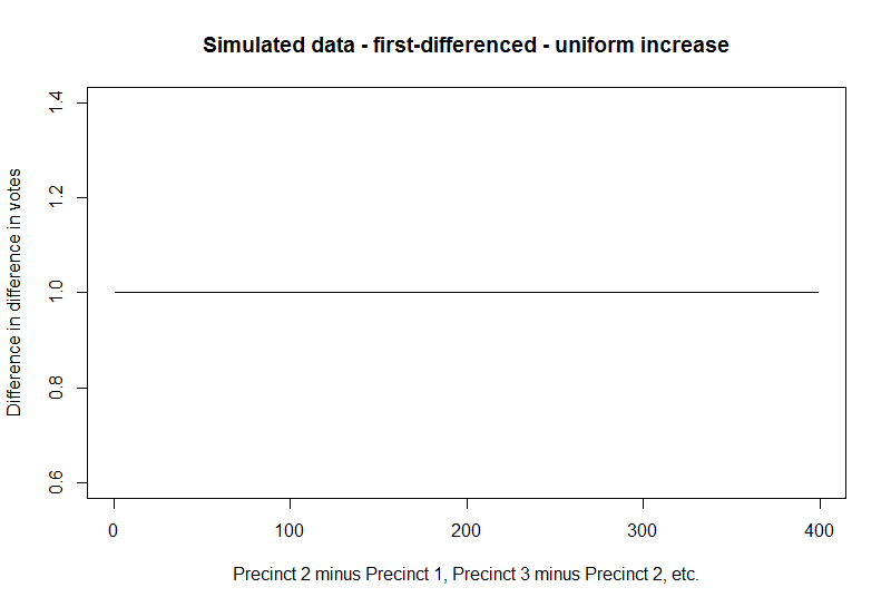
I will demonstrate with some more simulated data, but what I do below is what should be done with the full data if we ever get it. First, let’s say that after we get all points in, it is indeed as Contreras says – every time a precinct transmits, everyone’s vote totals go up by exactly the same amount, which would be extremely suspicious. I’ll use 400 precincts (time periods) for illustrative purposes, and make two plots: one where precincts in order of transmission are on the x-axis and difference in votes are on the y-axis, and one where the difference in differences are on the y-axis instead.

Then run a regression model on the data that form the second plot:
lm(formula = z_unif ~ index)
            coef.est coef.se
(Intercept) 1.00     0.00
index       0.00     0.00
---
n = 399, k = 2
residual sd = 0.00, R-Squared = 0.50
The R-squared is exactly 50% as expected. I will now plot the estimated regression line on top of the second plot:
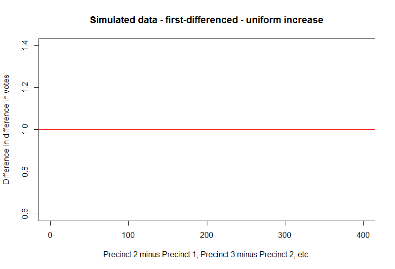
Remember that a regression model tries to fit a line to data as best as it can, so it’s not surprising that given uniform data, the regression line overlaps the first-differenced data entirely.
Now let’s say that the data look a lot more like we would expect from a normal transmission process – the gap is steadily increasing in favor of the leading candidate but we see dips and swings here and there as each precinct transmits. That data would look like this:

And the first-differenced data would now look like this:
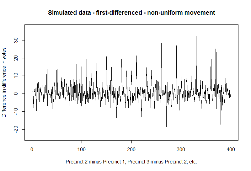
Here’s a regression model fit to that plot:
lm(formula = z ~ index)
            coef.est coef.se
(Intercept) 1.03     0.66
index       0.00     0.00
---
n = 399, k = 2
residual sd = 6.55, R-Squared = 0.00
The R-squared is now pretty much 0 (it’ll be more like 0.003 or something, but the model summary rounds to two decimal places).

Now you are trying to fit that volatile-looking zigzag with a single straight line. The model does the best it can, which ends up being a horizontal line drawn through the middle. But look at all the variation that the line doesn’t capture.
To conclude, a very good way to examine the claims of uniformity is to do what I did above on the actual data consisting of 92,509 precincts in order of transmission. You don’t even need to fit regression models, because the R-squared will plummet to near 0 at even the first hint of non-uniformity. You just need to eyeball the plot of difference in differences.
Code follows. Yeah, I know, I should be putting this on Github or something, but I’ll do that later.
install.packages("arm")

library(arm)

x_unif <- c(1:400)

y_unif <- c(101:500)

plot(x_unif, y_unif, type = "l", main = "Simulated data - uniform increase",

xlab = "Precincts in order of transmission",

ylab = "Difference in votes")

z_unif <- rep(NA, 399)

for (i in 1:399) {

z_unif[i] <- y_unif[i + 1] - y_unif[i]

}

index <- c(1:399)

plot(index, z_unif, type = "l", main = "Simulated data - first-differenced - uniform increase",

xlab = "Precinct 2 minus Precinct 1, Precinct 3 minus Precinct 2, etc.",

ylab = "Difference in difference in votes")

display(lm(z_unif ~ index))

abline(lm(z_unif ~ index), col = "red")

x <- c(1:400)

y <- c(runif(10, 100, 110), runif(10, 110, 120), runif(10, 120, 130), runif(10, 140, 150), runif(10, 130, 140), runif(10, 150, 160), runif(10, 160, 170), runif(10, 170, 180), runif(10, 180, 190), runif(10, 190, 200), runif(10, 200, 210), runif(10, 210, 220), runif(10, 220, 230), runif(10, 240, 250), runif(10, 230, 240), runif(10, 250, 260), runif(10, 270, 280), runif(10, 260, 270), runif(10, 280, 290), runif(10, 290, 300), runif(10, 300, 310), runif(10, 320, 330), runif(10, 310, 320), runif(10, 330, 340), runif(10, 340, 350), runif(10, 350, 360), runif(10, 380, 390), runif(10, 370, 380), runif(10, 360, 370), runif(10, 390, 400), runif(10, 400, 410), runif(10, 410, 420), runif(10, 420, 430), runif(10, 450, 460), runif(10, 440, 450), runif(10, 430, 440), runif(10, 460, 470), runif(10, 490, 500), runif(10, 470, 480), runif(10, 480, 490))

plot(x, y, type = "l", main = "Simulated data - zigzaggy",

xlab = "Precincts in order of transmission",

ylab = "Difference in votes")

index <- c(1:399)

z <- rep(NA, 399)

for (i in 1:399) {

z[i] <- y[i + 1] - y[i]

}

plot(index, z, type = "l", main = "Simulated data - first-differenced - non-uniform movement",

xlab = "Precinct 2 minus Precinct 1, Precinct 3 minus Precinct 2, etc.",

ylab = "Difference in difference in votes")

display(lm(z ~ index))

abline(lm(z ~ index), col = "red")

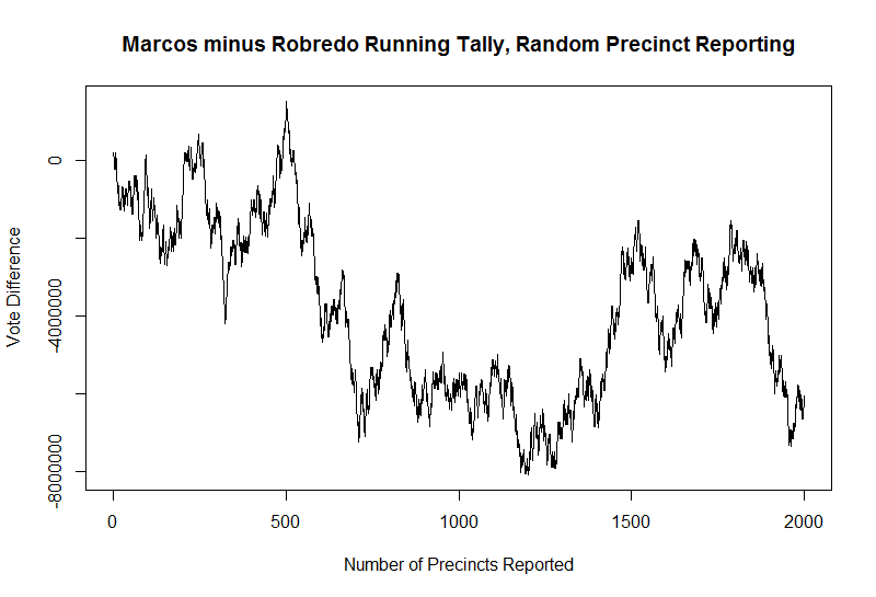 The difference between Marcos and Robredo votes looks to be a fairly random process as well, trending towards favoring Robredo (because that’s how I simulated the data here) but alternating unpredictably between narrow and wide gaps/peaks and valleys.

